Nothing Phone (3) Hands On: Different Yet Still Familiar
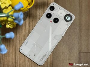
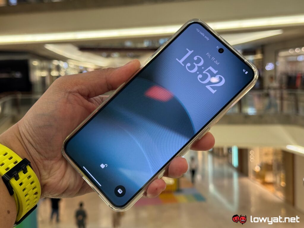
The Phone (3) is not just a new entry, but also an introduction to the next phase of Nothing’s design direction. While it retains the brand’s traditional transparent aesthetics (to an extent), the newer model is the first to drop the unique Glyph lighting system altogether, replaced with an all-new Glyph Matrix mini display on its rear panel.
At first, I wasn’t entirely sold on this idea. But as mentioned in the title, this is something that grows on me the more I use it.
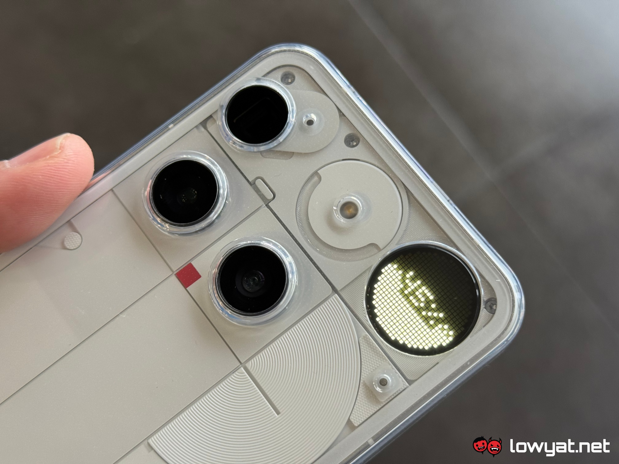
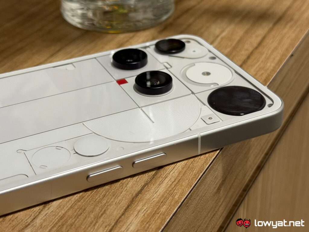
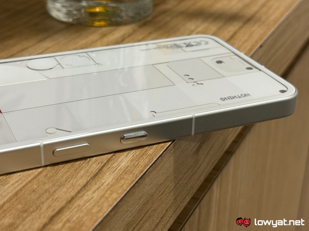
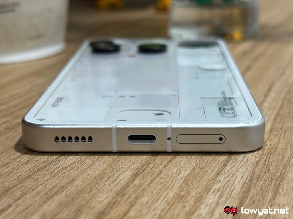
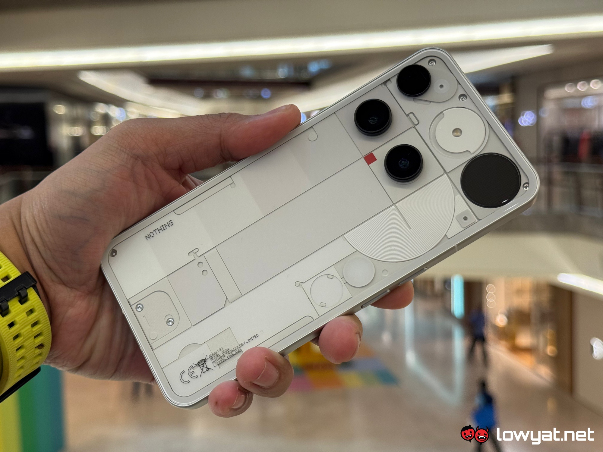
The same can be said for Phone (3)’s reworked rear panel design. Sure, it no longer displays a faux layout of the phone’s internals, and the camera layout can be very jarring. However, the redesign still does an excellent job of showing the world that this is a Nothing product through and through. It is very distinctive and recognisable, therefore easily distinguishable from other smartphones in the market that tend to follow repetitive patterns.
The Glyph Matrix itself does inherit some features from its predecessor, such as displaying notifications, battery charge and more, but through the new micro-LED display. And you can summon these – as well as built-in and custom pixel graphics – at command too, thanks to the addition of the dedicated Glyph button at the back of the Phone (3). Unlike the old lighting system, the display sits at the top-right corner of the case, making it visible to all. And yes, it can also function as a filler light for photography.
Speaking of which, imaging has improved significantly on the Phone (3), which now features a triple 50MP setup for its primary, periscope telephoto and ultra-wide lenses. Images shot by all three cameras return promising results, though there are still some things to nitpick, especially in regards to video. You’ll be certain that I’ll be talking more about this in my full review of the phone.
While we’re still here, I should also point out that another impressive feat is that all three cameras on the Phone (3) protrude only so slightly from the back of its case. This allows the phone to sit almost flat on surfaces, which contrasts the bulkier setup on Nothing’s earlier release, the mid-range Phone (3a) Pro. Other notable external features include the dedicated Essential Space button on the right-hand side, while the red box on the rear panel will actually light up whenever you record a video (this can be turned off in Settings).
What about everything else? As usual, I’ll save my thoughts concerning the performance of the phone’s Snapdragon 8s Gen 4 chip and battery for my review, so do look forward to that.
For now, I can share that the visuals exhibited by the Phone (3)’s display are on par with Nothing’s previous flagship, though its size is slightly smaller – coming in at only 6.67 inches, versus the predecessor’s 6.7-inch screen. Meanwhile, the Nothing OS interface is still one of the better Android skins out there, leaving plenty of room for both practicality and play. Like other smartphones from the brand, bloatware is kept to a minimum, but expect some first-party and Google developed apps preinstalled.
To recap the launch, the Nothing Phone (3) is available in White and Black colourways, priced at RM3,299 for the 12GB + 256GB configuration and RM3,799 for the 16GB + 512GB. Pre-orders will be available through official and authorised Nothing channels starting tomorrow, while first sales start from 1 August 2025 onwards.
For those who want it earlier, a limited run of the Nothing Phone (3) will be available at Crossover Sunway Pyramid on 19 July 2025 at 11am. Those who purchase the device there are entitled to receive a free storage upgrade and complimentary gifts, including Nothing branded cap and lanyard, Nothing Ear, as well as one-year extended warranty.
The post Nothing Phone (3) Hands On: Different Yet Still Familiar appeared first on Lowyat.NET.

